یکشنبه دوازدهم مرداد ۱۳۹۹ - 17:42 - حسين حسين پور -
An average line plays an important role whenever you have to study some trend lines and impact of different factors on trend.
And before you create a chart with a horizontal line you need to prepare data for it.
Before I tell you about these steps let me show how I am setting up the data.
Here I am using a dynamic chart to show you that how this will help you to make your presentation super cool.
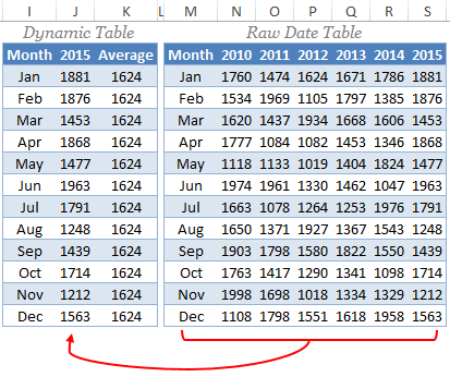
In above data tables, I am getting data from raw table to the dynamic table by using a VLOOKUP MATCH.
Every time when I change the year in the dynamic table it will automatically change the sales values and the average will be calculated on those sale figures.
Steps to Add an Average Line
Below are the steps you need to follow to create chart with an horizontal line.
- First of all, select the data table and insert a column chart.
- Go To Insert ➜ Charts ➜ Column Charts ➜ 2D Clustered Column Chart. or you can also use Alt + F1 to insert a chart.
- So now, you have a column chart in your worksheet like below.

- Next step is to change that average bars into a horizontal line.
- For this, select the average column bar and Go to → Design → Type → Change Chart Type.
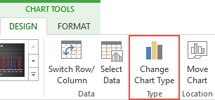
- Once you click on change chart type option, you’ll get a dialog box for formatting.
- Change the chart type of average from “Column Chart” to “Line Chart With Marker”.
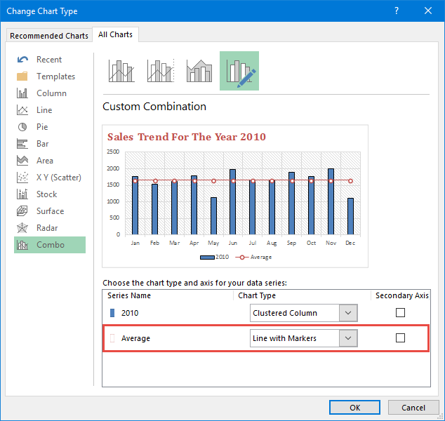
- Click OK.
- Download file
 با نام و یاد خدا