Sometimes while presenting data with an Excel chart we need to highlight a specific point to get user’s attention there.
And the best way for this is to add a vertical line to a chart.
Yes, you heard it right.
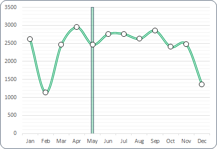
You can highlight a specific point on a chart with a vertical line. Just look at the below line chart with 12-months of data.
Now, you know the benefit of inserting a vertical line in a chart. But the point is, which is the best method?
Well, out of all the methods, I’ve found this method (which I have mentioned here) simple and easy.
Steps to Insert a [Static] Vertical Line a Chart
Here you have a data table with monthly sales quantity and you need to create a line chart and insert a vertical line in it.
Please follow these steps.
- First, you need to add a new column and name it “Ver Line” or anything you want.
- After that, enter the value “100” for Jan in “Ver Line” column.

- Now, select the entire table and insert a line chart with markers.

- Once you do that, you’ll have a chart in like below in your worksheet.

- From here, select the chart and open the “Change Chart Type” options from Design Tab.
- After that, change the chart type to the secondary axis and chart type to “Column Chart”.

- Now next thing is to adjust axis values for your column bar so double click, on the secondary axis to open formatting options.
- Next, change the maximum value to 100, as we have entered the same value in “Ver Line” column.

- In same axis options, move down to label position and select none (This will hide secondary axis, yup we don’t need it).

- Last but not least, you have to make our column bar a little thin so that it will look like a line, so, click on the data bar, go to series option and increase your “Gap Width” to 500%.

Congratulations! You have successfully added a vertical line in your chart.
Quick Tip: Just enter 100 in the cell where you want to add a vertical line. If you want to add a vertical line in Feb instead of May, just enter the value in Feb.
Steps to Add a [Dynamic] Vertical Line in a Chart
- First, you need to insert a scroll bar and for this, you have to go to the Developer Tab ➜ Insert ➜ Scroll bar.

- After that, right-click on the scroll bar and open the format control options.
- Next, you need to link the scroll bar to a cell (Let’s say C10) so that you can have a number on moving the scroll bar, and you also need to enter the maximum value (enter 12 as we have data for 12 months).
- Now, click OK.

- From here, next, you need to use the below formula to get the value in the cell as per the position of the scroll bar,
=IF(MATCH($A2,$A$2:$A$13,0)=$D$1,100,””)
(This formula basically takes the value for the position of the scroll bar and then match it with the month list and return the value “100”. So if the scroll bar is at 5th position it will return the value 100 in the cell which adjacent to the May month in the “Ver Line” column).
- Now when you move the scroll bar the value moves in the “Ver Line” column.

- The next thing is to insert a line chart and apply the secondary chart for the vertical line as you have learned earlier.

- Download 1
- Download 2
 با نام و یاد خدا