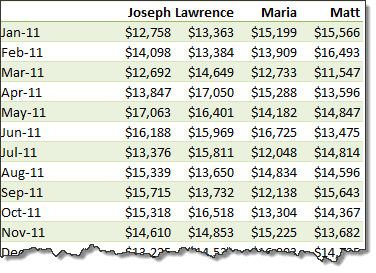
Pivot tables are great help when analyzing lots of data. One of the common questions managers & analysts ask (when looking at monthly sales data for example) is,
How is the monthly performance of our teams (or regions, products etc.)?
A pivot report can answer this question in a snap.

But the answer is incomplete!
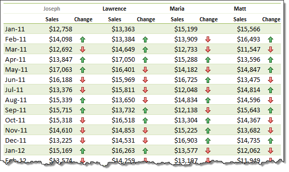
Why? Because, we don’t want sum of sales by month & sales person alone. We want to know their performance! Something like below:

Performance eh?!? How to measure it?
There are many ways to measure performance. For our monthly sales data, we can measure performance by comparing,
- Sales with targets
- This month value with previous month value
- This month value with same month last year value
- One person’s sale with rest of team etc.
One of the most common ways to measure performance in situations like this is to see how this months value has changed compared to previous month.
How to show monthly values & % changes in pivot?
Do you know that with just a few clicks, we can add % changes to our pivot? Follow these steps:
1. Create a pivot report with months & sales persons (or months & products, months & regions etc.)
 با نام و یاد خدا